Sprouts
Teaching users how to care for their plants through a fun and relaxing game.
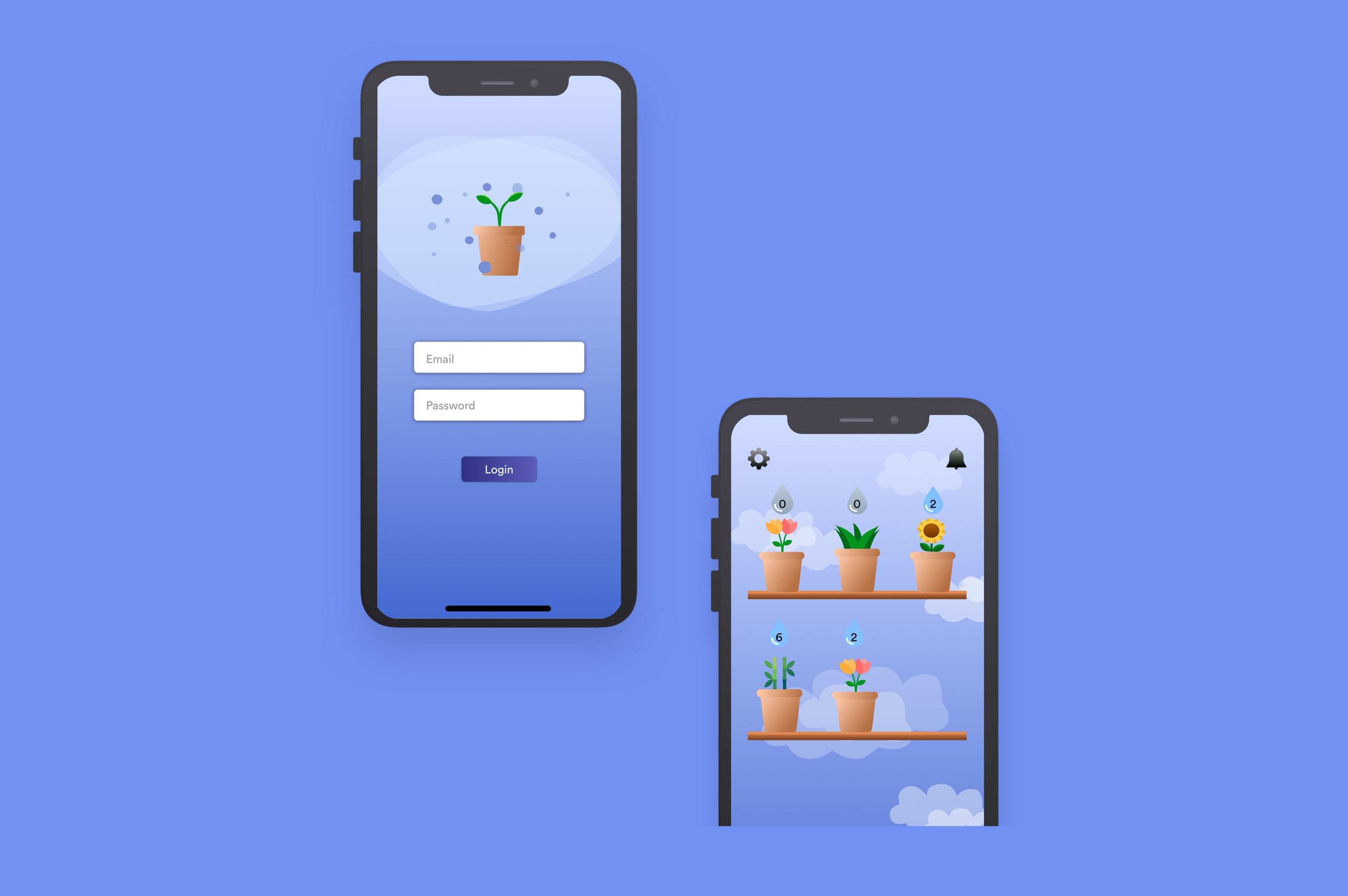
Project details
Product: iOS app
Team: Wren Liang, Alan Yan, Andrew Zulaybar, Jessica del Rosario
Role: UX/UI Designer
Tools: Sketch, InVision
Timeframe: 24 hours (Hackathon: nwHacks)
Please feel free to view our slide deck outlining our research and design process here.
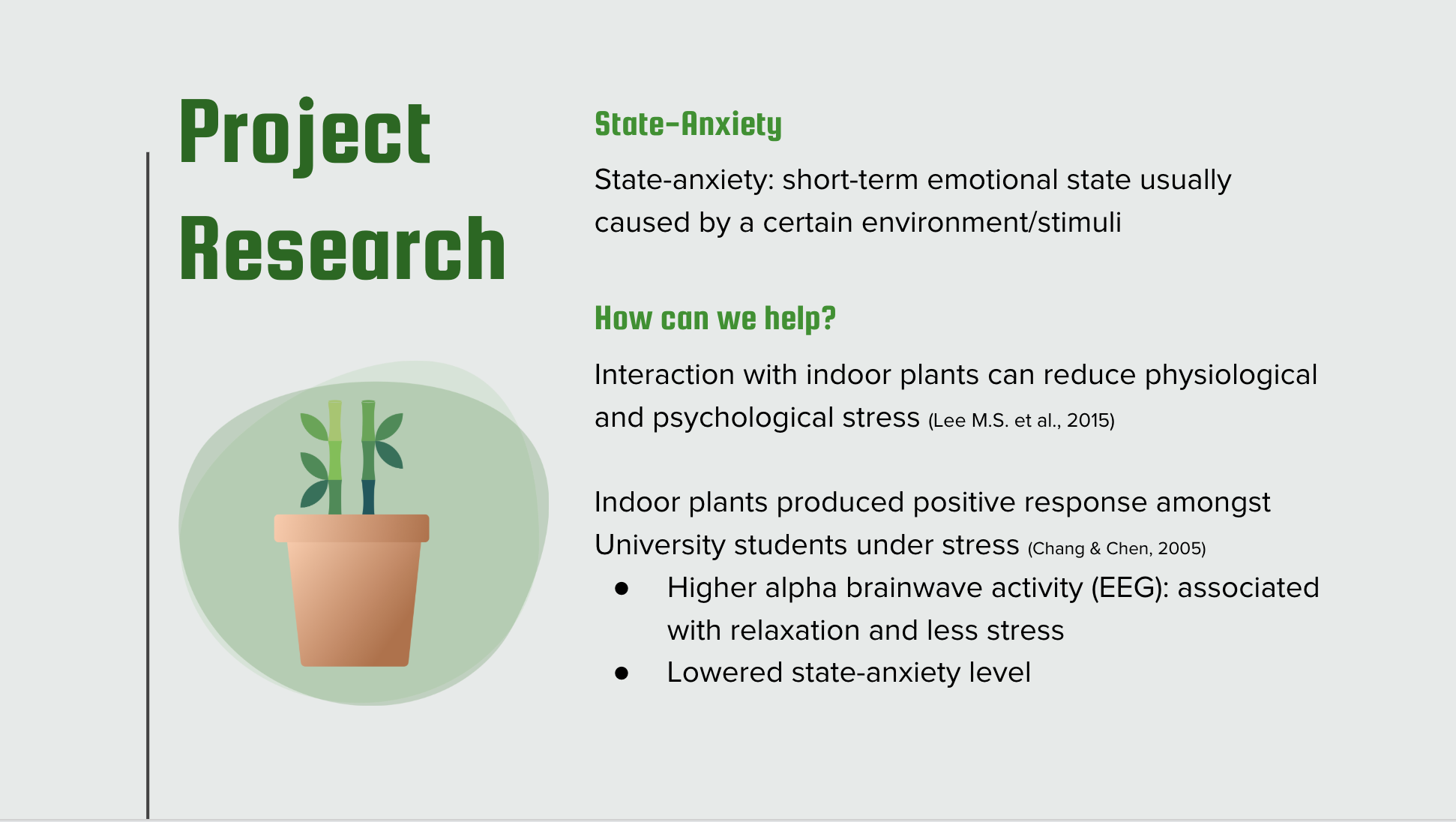
Project goal & Research
Interaction with indoor plants can reduce physiological and psychological stress, based on previous psychological and neurological studies. In addition to creating a game-like app that helps users remember to care for their plants, the goal of this project was to help reduce their stress levels.
MVP:
- Water plants
- Add plants
- See plant details (how much water and sunlight needed)
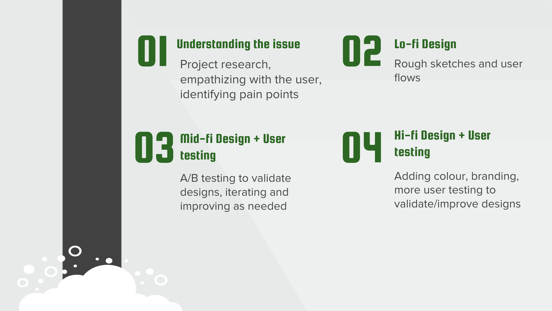
Design process
For the purpose of this 24-hour hackathon, I followed but condensed the classic design thinking process, ensuring enough time to validate my designs through user testing.
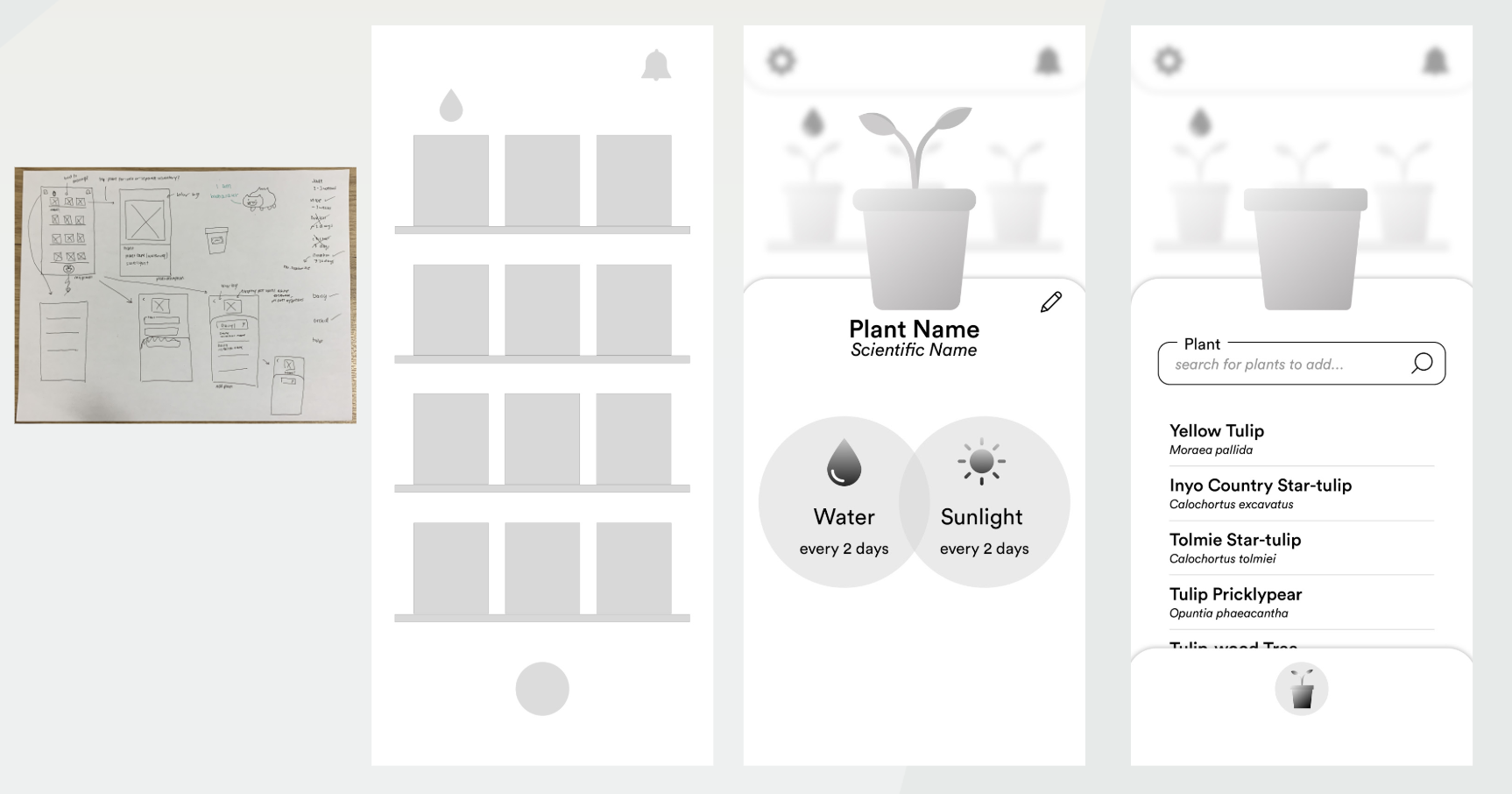
Low-fidelity & Mid-fidelity designs
Due to time constraint, only simple A/B testing was used to validate or improve mi-fi designs before they were converted to hi-fi.
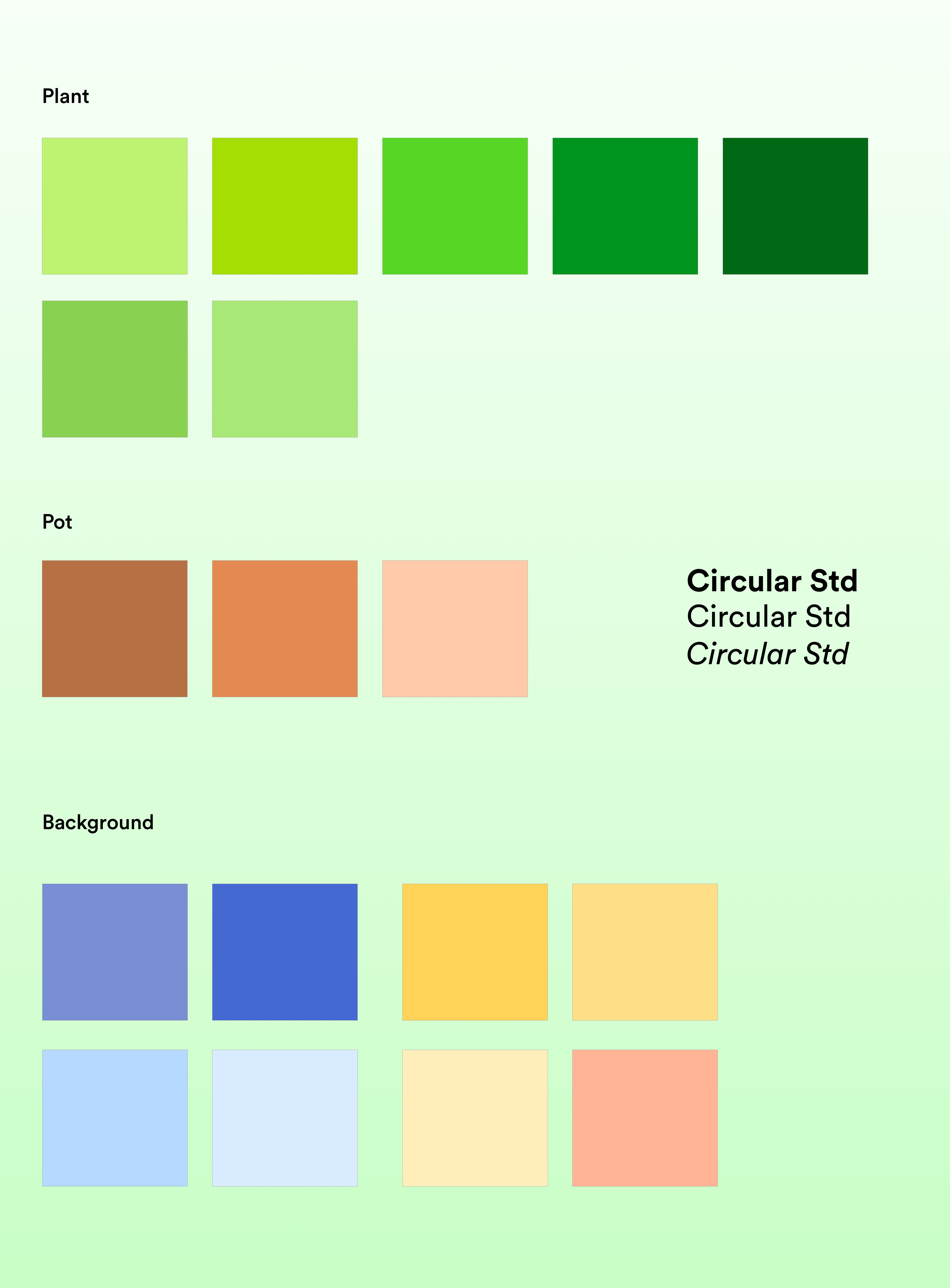
High-fidelity designs & UI library
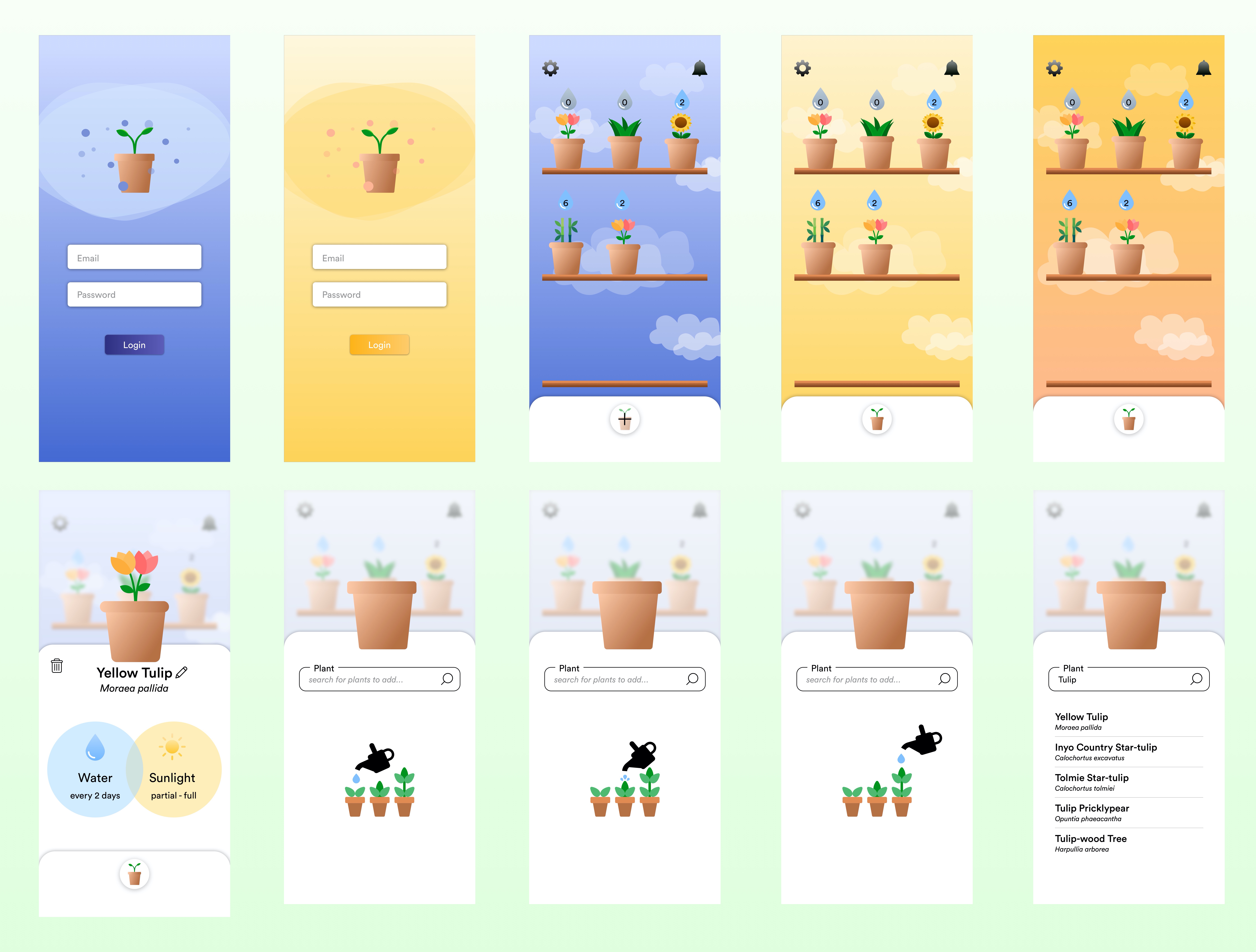
This app was designed with the ability to take users from day mode (yellow) to night mode (blue) in order to induce productivity during the day, and relaxation at night. The watering can splash screen was also implemented to ensure users would know the app was loading, not frozen.
High-fidelity user testing + Solutions
Task scenarios were used to identify pain points in the hi-fi designs.
Pain points:
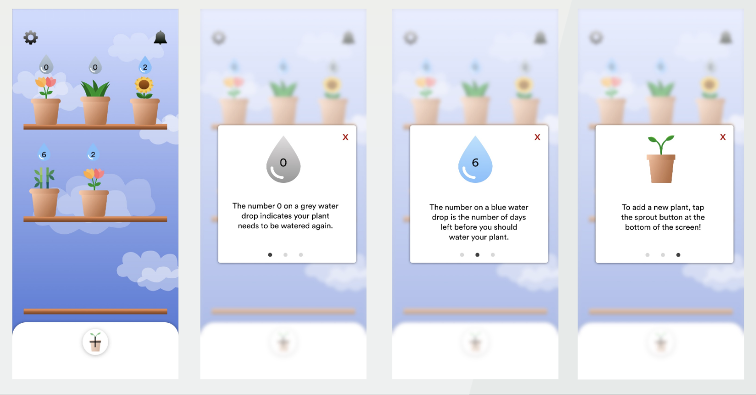
- 'Add plant' button not intuitive - previously had no '+' symbol, just a plant icon
- Purpose of the number above each plant is unclear - originally meant to indicate days left until watering
- The dry plants should have a grey drop, while the watered plants should have a blue drop - not the other way around
Solutions:
- Added '+' symbol to 'add plant' button
- Created onboarding instructions to clarify purpose of numbers and water drops
- Grey drop for dry plants, blue drop for watered plants
Challenges + Flaws
Due to the 24 hour time constraint, there were limitations to the improvements we could build and design after testing the product. For example, many users tend to actually skip onboarding instructions, so while they served their purpose of explaining how to use the app, it was not confirmed that it actually worked to solve the problem of confusion for users. Given more time, we would've liked to spend more time ideating upon more comprehensive design solutions for users, and testing whether they aligned with users' needs.
What's next for Sprouts
I'd like to create interfaces for outdoor gardening (currently the UI is catered towards indoor plants) and trying to add different types of weather, such as rain, for the background. Further testing and improvements will continue on current interfaces as well!
