Snack logo animation
Designing a logo + animation as part of a challenge for the video dating app, Snack.
PROJECT DETAILS
Tools: Figma, Adobe XD
Product: Logo, Animation
GOAL + RESEARCH
My goal was to create a simple yet fun logo that incorporates Snack's youthful and dynamic approach to dating apps, while also ensuring that it can be used in many different ways (e.g. night/day mode, on the app itself over a video, for marketing purposes, etc.). Keeping in mind the app's target age demographic of roughly 18-24, I also analyzed the logos of other successful dating apps with similar user demographics, exploring how they drew a connection between their app's concept, logo, and name.
PROCESS
-
Ideation + Low-fidelity sketches
Based on the main idea of video-first dating, along with the idea of a clean, yet youthful brand that Snack seemed to be going for, I did around 50 sketches of different logos. I then chose the strongest few ideas and began vectorizing them.
-
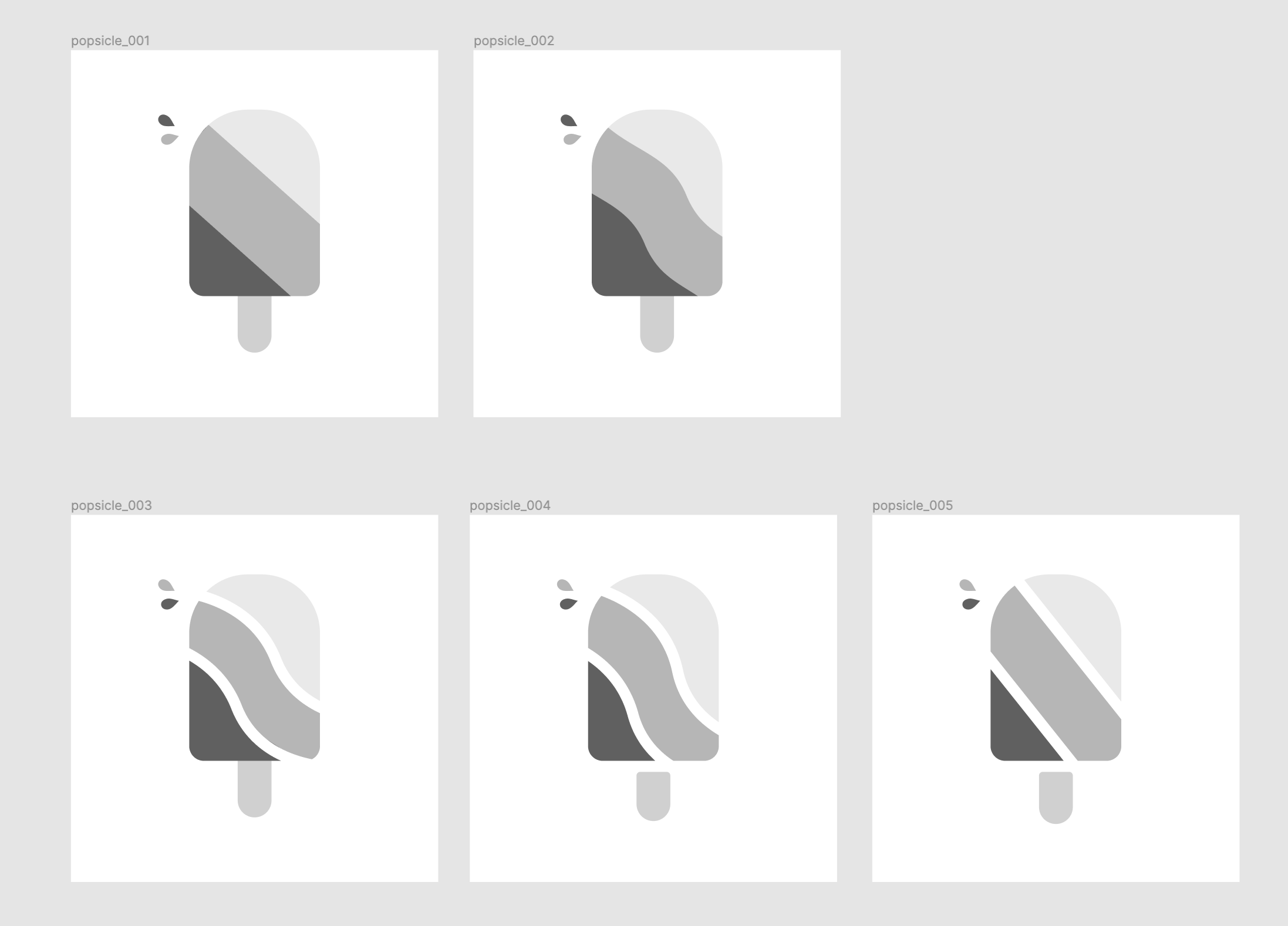
Greyscale mid-fidelity designs
Before adding colour, I focused on the shape of the logo. This helped me refine the structure of the logo before worrying about different colour choices.
-
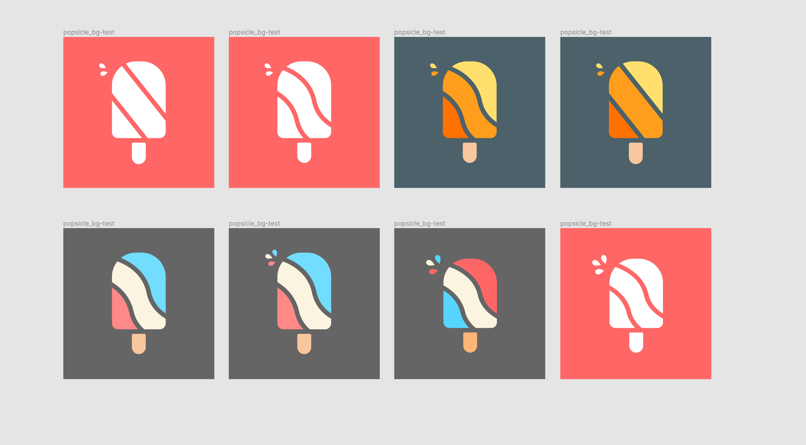
Adding colour
I aimed to match the refreshing and bright concept that Snack seemed to portray, so I focused on using vibrant complimentary colours. I also wanted to have a version of the logo that could be used on multiple different coloured backgrounds, so I tried to ensure the shape I chose would still be distinguishable even if it was all one shade such as white.
-
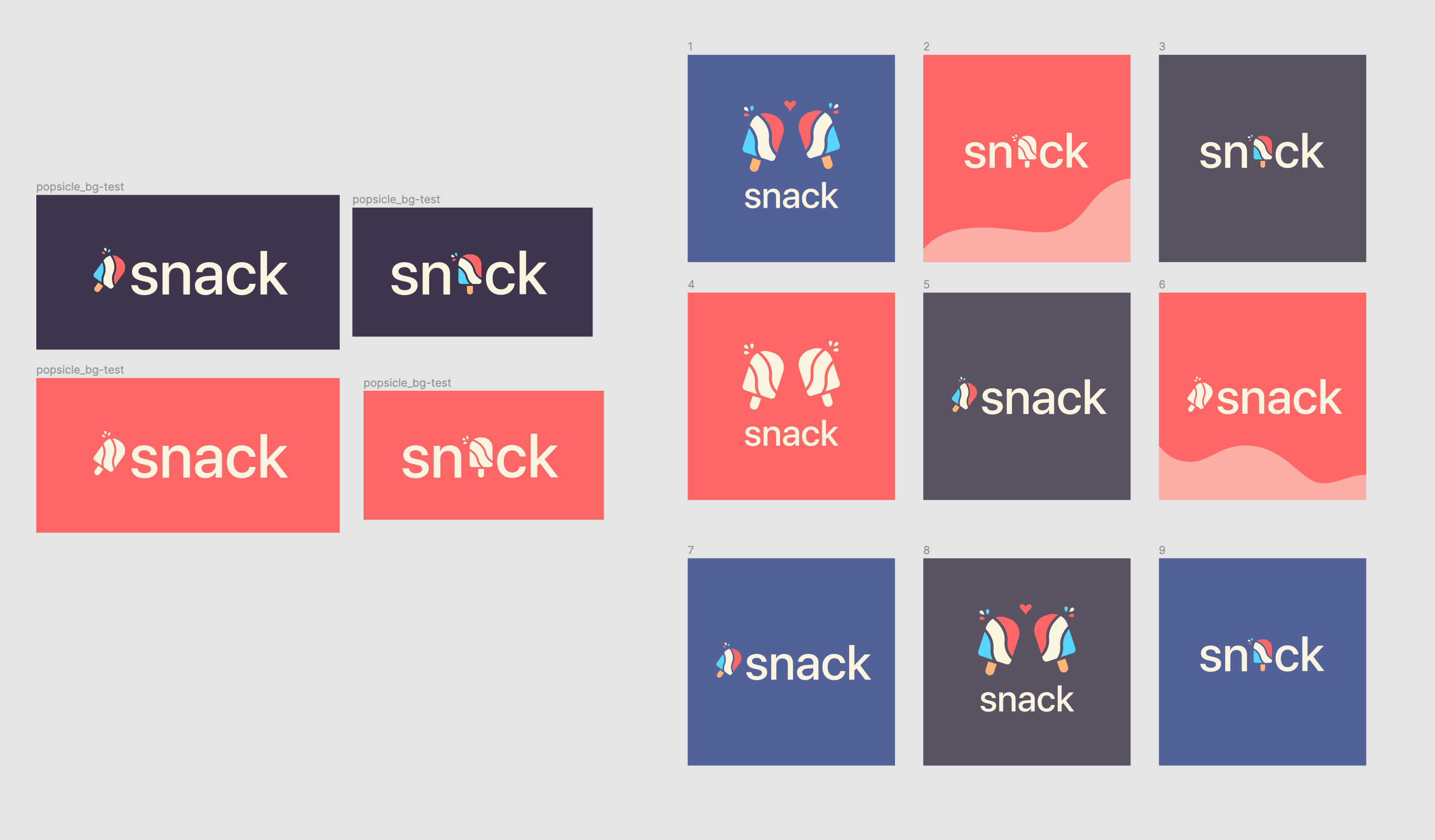
High-fidelity designs + Branding
I explored different ways that the logo could be incorporated with the app's name, along with creating an animation to display the different ways that the logo could be applied.
CHALLENGES + WHAT I LEARNED
I mainly struggled with choosing colours that represented the fun and youthful concept of Snack while also maintaining accessibility - this is something that is still open to feedback and iteration! However, I learned a lot about animation in this process as I wanted to create a dynamic demo to showcase the logo and all its use cases. In the future, I hope to spend even more time on the colour choice and hopefully get feedback from the team at Snack to ensure that my design decisions match their goals for the app!