Keepfresh
How might users keep track of and use their food before it expires?
Project details
Product: iOS app
Team: Connor Fong, Alan Yang, Wren Liang, Noor Khan, Nanda Syahrasyad, Andrew Zulaybar, Sang
Le, Sandy Co, Jessica del Rosario
Role: UX/UI Designer
Tools: Sketch, InVision, Figma
Timeline: 4 months (MVP), 8 months (final product)
Background
Keepfresh is an iOS app I built collaboratively with a team of 7 developers, a marketing strategist, and fellow UX/UI designer. As a designer, I conducted user surveys + interviews, created wireframes + prototypes, validated my design decisions through testing, and effectively communicated with my interdisciplinary team while iterating upon their feedback.
Project goal
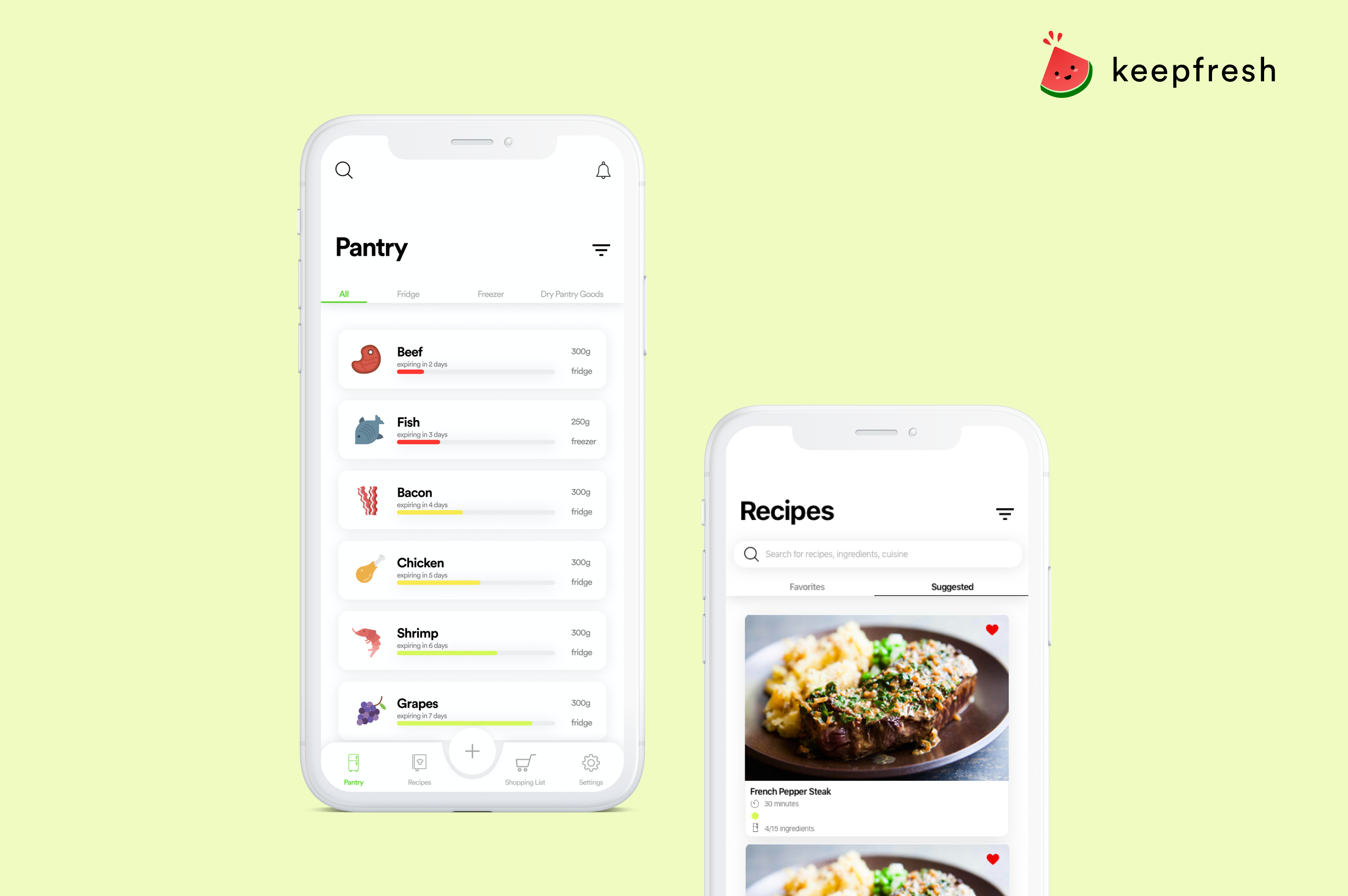
Build, design, and conduct research for an iOS app that will allow users to track the food in their homes, see when items are expiring, and find recipes based on their inventory.
General process
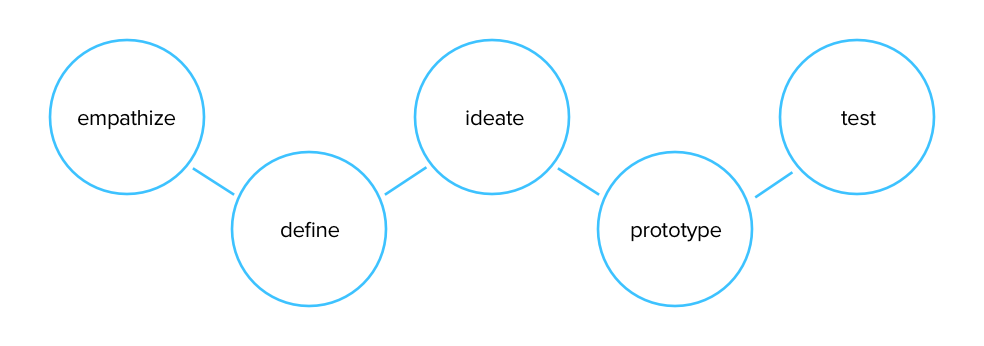
- Empathize: User interviews/surveys, seeking to understand
- Define: Pain points, prototyping personas, role objectives, challenges
- Ideate: Share/diverge/converge ideas, determine MVP
- Prototype: Mockups, simple storyboards, failing fast and iterating quickly
- Test: Understand problems, 'What works? What doesn't work?, iterate
Research process
Low-fidelity research
We conduced user surveys and interviews to help us gain a deeper understanding of the main problems people experience when keeping track of their food - this helped us develop our main user flows and determine what functions to include in our design solution.
- Surveys (78)
- Interviews (20)
- Participants: 17-30 year olds in North America
Mid-fidelity research
Scenario tasks helped us validate our user flows and identify pain points. A/B testing also helped us isolate which versions of each interface to continue to iterate upon.
- Scenario task + think-aloud process
- A/B testing
The problem
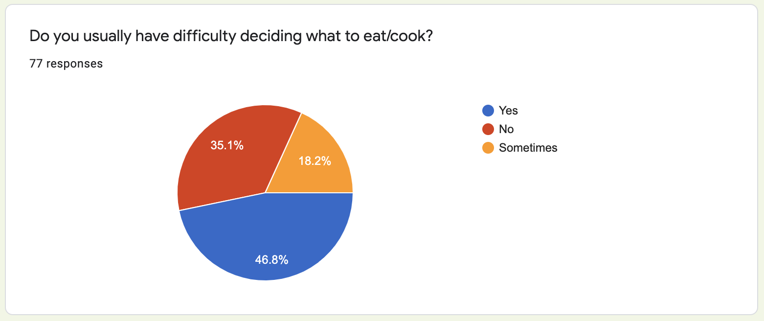
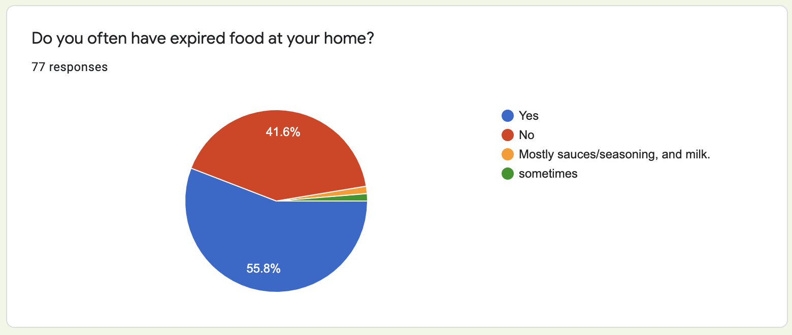
After analyzing the data from our user surveys and research, we narrowed down the 3 main problems that people seemed to have with food management.
- Forgetting: People tend to forget what they have/don't have, which can result in buying too much of something, or allowing something to go expired without noticing.
- Cooking Time and Experience: Many people have a limited amount of cooking time and knowledge - this can cause difficulties in finding recipes that are quick and easy enough, but still tasty.
- Finishing their food: Many individuals, especially those who live alone, have a hard time finishing all of their food off before it expires, or finding dishes to make that use up all their ingredients.
Solving the problem
We created 3 main solutions solve these 3 main problems.
- Pantry page: The 'pantry' or 'fridge' page allows users to see all of the food that they currently have, with notifications of expiry as well as the items listed in order of nearest to furthest expiration. Users will be able to add items manually or scan their grocery shopping receipt barcode to add all of those items automatically.
- Recipes page: Users will be able to find recipes based one what they have in their fridge (or any recipes in general), along with filters for cooking time, difficulty level and more.
- Shopping list: Users will be able to add recipe items that they are missing directly from the recipe page to their shopping list (or manually), and as soon as these items are checked off the list, they will be added to the pantry.
Keepfresh user flow demo:
Target users
For our minimum viable product, our target users were individuals living on their own or not sharing food with roommates/family members.
We aimed to effectively solve the food management problems that this demographic was experiencing, and further expand on the solutions with time so that multiple users could add and remove items from the same inventory. In this sense, our product could also help families and those who share their food with others.
Low-fidelity wireframe sketches
After synthesizing the data from our user surveys and research, we narrowed down which features may be most useful and sketched out wireframs for our MVP, while iterating upon feedback from engineers.
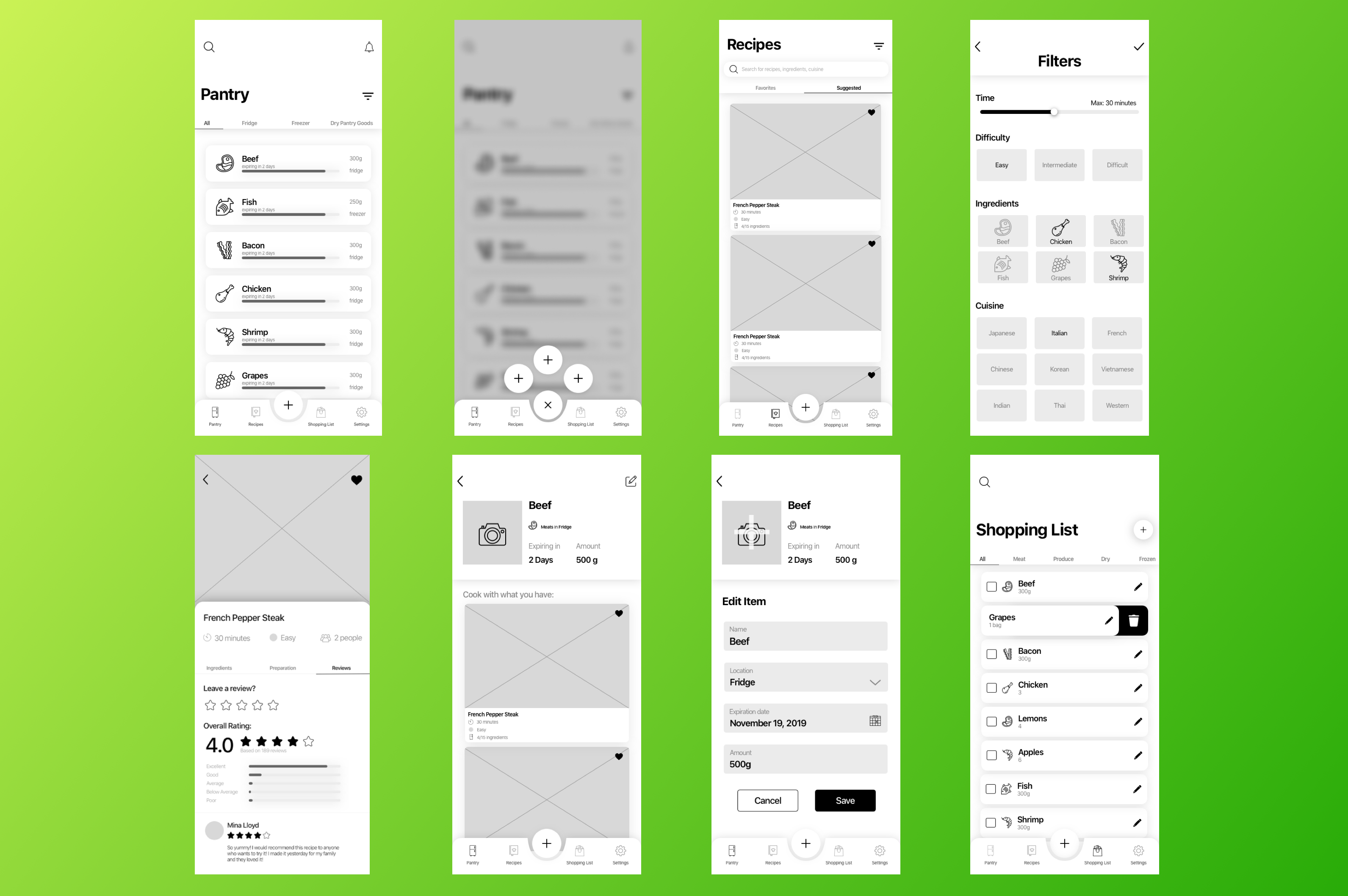
Mid-fidelity designs
After completing more user tests and validating our low-fidelity wireframes, we created grayscale wireframes, which we also tested to narrow down the most intuitive iterations.
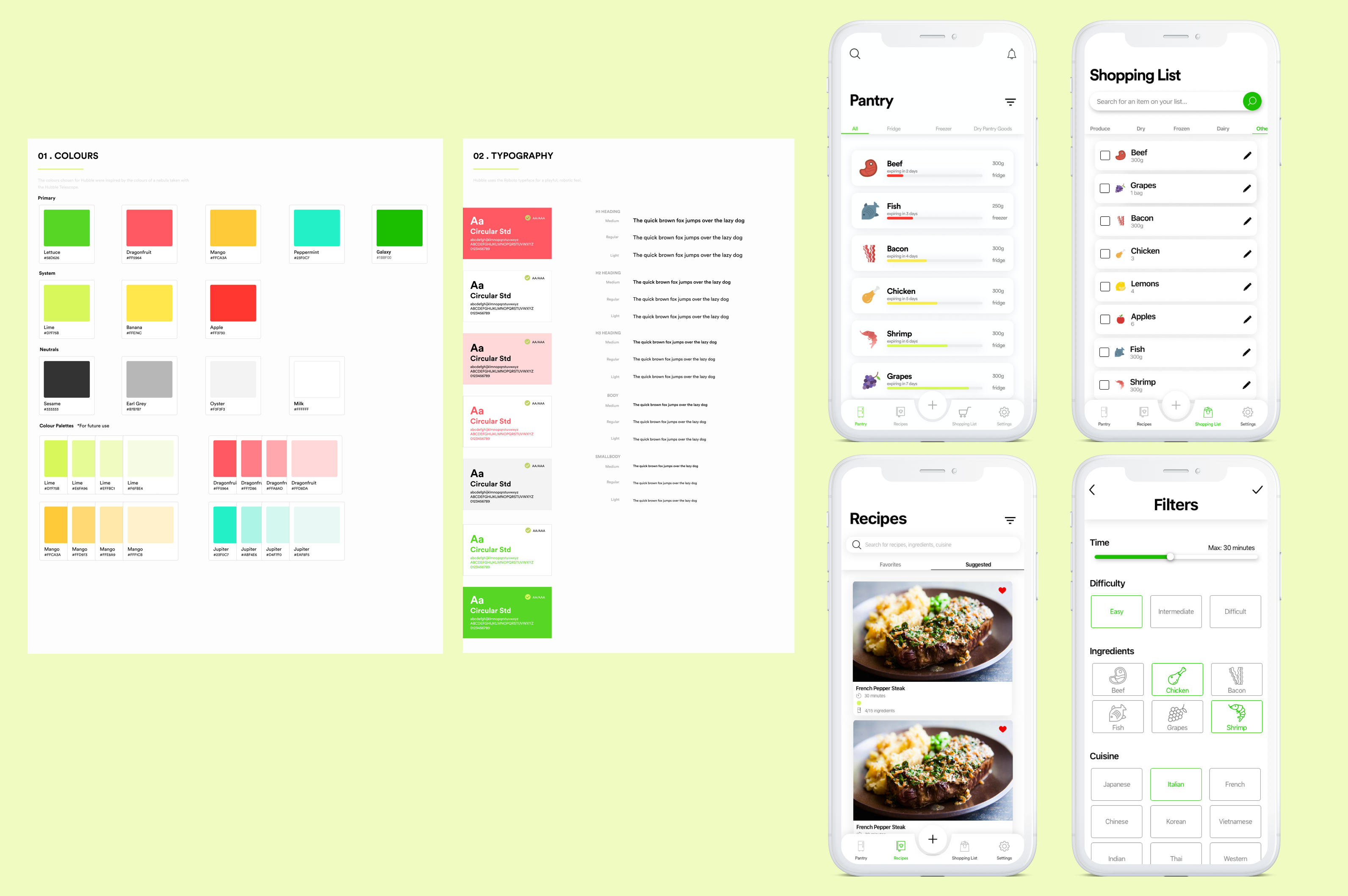
UI library + High-fidelity designs
We created a UI library featuring the main colour palette and typeface we used. This allowed us to ensure that our high-fidelity designs met accessibility requirements, while still adhering to a consistent brand.
Challenges
As a designer, I faced the challenge of ensuring that the the interfaces I created were feasible for our engineering team, while still making it clean and intuitive. Given our time constraints, certain elements that we designed, like the receipt barcode scanning function, were not able to be fully completed.
From this, I learned to always communicate with engineers throughout the design process, taking into account their technical constraints. This has helped me allocate my time as a designer to optimizing the product for both our users and engineers, while also better understanding how the product itself works.
Next steps
- Further testing of prototypes to validate/further improve upon high-fidelity interfaces and interactions.
- Ensuring all functions are properly implemented (e.g. scanning receipt barcode, order of pantry items listed from closest to furthest expiry).
- Designing individual profiles and settings so multiple users can share a fridge by creating groups.
